1. Perfecting the Text
The first thing your visitor will see is the appearance of the landing page. Make sure your headline is clear and action oriented. Use numbers, bullets, and bolding to clearly state your offer and get right to the point. Do not use too many words in your offer description, for that is how people get bored and uninterested. Your font should remain the same throughout the landing page so that it looks professional and is easy to read.
2. Design
The design of your landing page is all about getting your audience interested and excited to learn more. What catches someones eye better than a pop of color? Make your landing page colorful. Add images that grab the visitors attention. A colorful image that grasps the theme of your business should be inserted into the landing page. That way people get a better idea of what your offer is all about. Make sure your image is large and clear as well. Somewhere in your landing page be sure to add social media icons. Visitors can click on those icons to share your landing page and offer.
3.Eliminate Distractions
When visitors are on your landing page you want them to focus on one thing and one thing only. They are there to fill out their information and convert themselves into leads. That being said, there should be no distractions on the landing page. Distractions include a navigation bar or external links on the landing page. These diversions can take away from the visitor's focus, causing your company to lose a lead.
4. Make it Mobile
In today's society people's phones are basically glued to their hands. Obviously your landing page and website is accessible through a computer but it should also be perfectly accessible on any mobile device. Make sure your landing page is mobile responsive so your visitors can easily view it on their phones. If your audience goes to click on your landing page and they are unable to see it on their phone, your company will be lose leads left and right.
5. Revise, Revise, Revise
We are human, we make mistakes. Make sure you edit and revise your landing page so that you catch any mistakes you might have made. Grammar and spelling errors are bound to happen on a first draft of anything. It is always a huge help to have a new fresh pair of eyes look at it after you do. Someone else might be able to catch a mistake that you were not able to. The perfect landing page is only effective if it is error-free. In addition, A/B test different calls to actions, text, titles, and images to see what has the highest conversion rates.
Example:
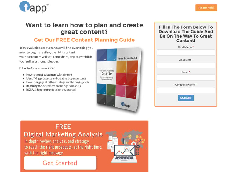
As you look at the landing page above, you will notice a couple things. It has a clear, strong title that is easy for visitors to read. It includes bolding and bullet points that list information about the offer. It also includes a bright image that shows what the company is offering. The last thing I will point out is the fact there is no navigation bar or external links for visitors to click on and get distracted by. Use these tips and the landing page above to help guide you on creating the perfect landing page to double your company's leads.


